Project

Project
Client
Role
Timeline
Most flower stores offer standard fresh flower bouquets that need same-day delivery and have no bouquet customization. Customers need an app which will help them to make bouquets more personalized and unique.
Stores that provide custom items based on specific designs that the customer provides are becoming increasingly popular. Customization and the possibility to write messages on a greeting card will help to personalize orders and may attract more buyers who want to buy something unique.
An app will add interactivity to online shopping and reward a flower shop with repeat orders over time. Great user experience can increase the loyalty of the clients. Loyal buyers consistently choose to buy from a particular shop, recommend it to friends and often defend it against its competitors.
• To understand the goals and frustrations of the customers.
• To create an appealing and functional app that shows all the details of the bouquets.
• To add possibility to include/exclude flowers and create a customized bouquet just in few clicks.
• To add the function to choose greeting card and write a message during the checkout to make customers orders personalized.
• To add the possibility to track an order.

Firstly I studied the questions and feedbacks from existing customers. I found out what are the main users pain points and which options are really important to them. Below are the screenshots with messages from DryDry customers.

To understand what problems users may face during online orders, I conducted an interview with 5 people. My questions were the following:
I conducted interviews and created empathy maps to understand the users. A primary user group identified through research was brides and adults who like to make unique gifts. This user group confirmed initial assumptions about DryDry customers, but research also revealed other user problems including delivery, terms of condition, and visualization.
Customers often want other size, colour, to add or exclude some flowers from the bouquet
Users want to add a gift messages to their orders
Users afraid that the flowers won’t arrive till the necessary date or will be damaged


I looked at 4 potential competing Flower Shops. The majority of the features between competitiors were very similar, but each shop had its strenths and weaknesses.
Competitors:
Bloomon, Bries aan Zee, Idlewild, Flowers and Powers.
• Poor product description
• Low quality images
• Poor accessibility
• No brand identity
• International shipping
• Strong delivery quality standards
• Custom flower gift box
• Recycled packaging
• Wishlist
I constructed a user flow of what a basic start to finish journey looks like while purchasing an item. This helped me in understanding ways users can interact with the product, as well as allowing me to see navigation through user goals.

After sketching out some wireframes and thinking through the preliminary flow, I reviewed what was nessecary and what areas needed improvement.

Using the completed set of digital wireframes, I created low-fidelity prototype.

I conducted two rounds of usability studies.
Findings from the first study helped guide the designs from wireframes to mockups.
I gathered information from the first round of the usability study and ran a card-sorting session. I grouped the cards by similarities in 4 groups that reflect user concerns.IterationI’ve changed the button “add message” to the link and left only call to action button, and removed the function “choose colour”. Because users were overwhelmed with the number of steps.
.png)
I’ve changed the button “add message” to the link and left only call to action button, and removed the function “choose colour”. Because users were overwhelmed with the number of steps.
.jpg)
The second study used a high-fidelity prototype and revealed what aspects of the mockups needed refining.
• It’s necessary to add link to gift message to checkout page
• Add arrow to back to order link
• Add arrow to photos on the main page to show they are scrolling
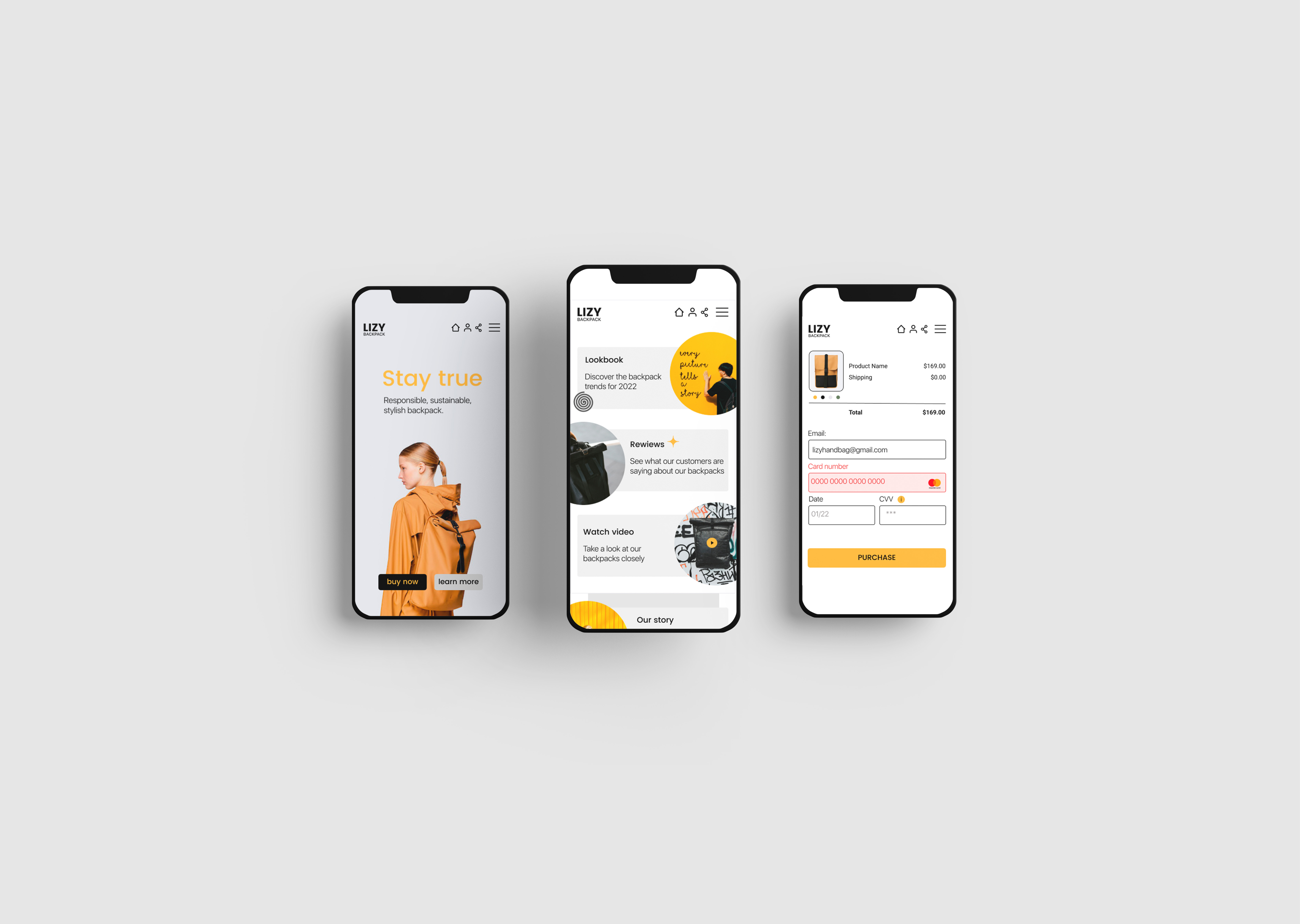
I’ve changed the logo which led to the main page to “back to catalogue” link because I had a home icon at the bottom of the page. Back to catalogue link will help customers to add more products to the cart or change their choice if they need to. I added dots under the photo to show customers that they can swipe and see more photos.


The app makes users feel a bit like designers because they can take part in creating their bouquets and have possibility to order unique items just in several clicks.
While designing the Dry Dry app, I learned that the first ideas for the app are only the beginning of the process. Usability studies and peer feedback influenced each iteration of the app’s designs.